Designing With Color: Complementary, Analogous, Monochromatic & Triadic Color Combinations
READ TIME: 2 minutes
Your client just handed you a bunch of swatches of her “favorite colors” to incorporate in an upcoming event, and they absolutely do not all go together. You’d love to explain this to her in a scientific way so that she’s not offended. What are the best practices for using color in events?
Harmonious Use of Color
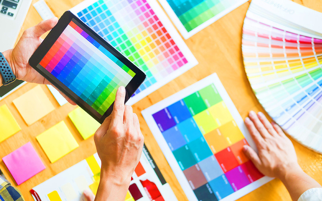
While design is an art, which can be hard to teach, understanding how colors interact is really more of a science and is something you can learn and master. There are several ways of combining color in an event’s color palette to make them pleasing to the eye.
- Complementary: Complementary colors are any pair of colors located directly across from each other on the color wheel. Examples include red/green, blue/orange, yellow/purple, etc. These colors show the most contrast from each other and as a result are very eye-catching. You may notice that sports teams (like the NY Mets, Denver Broncos & Los Angeles Lakers) often use these types of colors because they stand out and can be noticed from afar.
- Analogous: Three or more colors that are next to each other on the color wheel are analogous. One is the dominant color and is usually a primary or secondary color. These color schemes are often found in nature and tend to be the most calming.
- Monochromatic: A monochromatic color scheme utilizes a single color (hue) with different variations of that color (using tints, tones, & shades). This is a sophisticated design method that is very pleasing to the eye, but the subtlety involved takes some experience to execute. This is an advanced technique.
- Triadic: A triadic color scheme uses three colors that are evenly spaced apart on the color wheel. The green-purple-orange palette is a common example of a triad. The colors should be configured with one dominating and the other two providing accents to the overall look. This technique requires some advanced design chops to execute; otherwise ot can result in a look that feels busy and loud. This is also an advanced technique.
Tips
- Buy a color wheel online or at a craft store for under $10. It’s a useful tool that shows all of the above information, as well as numerous additional insights on color pairings.
- Consider how other elements in your space will influence the color design. Items such as light fixtures, mirrors, or natural light can have a significant impact on your color choices.