Designing With Color: Primary, Secondary & Tertiary Colors | Hues, Tints, Tones & Shades

READ TIME: 2 minutes
Your client just handed you a bunch of swatches of her “favorite colors” to incorporate in an upcoming event, and they absolutely do not all go together. You’d love to explain this to her in a scientific way so that she’s not offended. What are the best practices for using color in events?
Colors 101
Let’s start with the basics. You probably learned some of this in art class in elementary school, but now there are some practical applications for it.
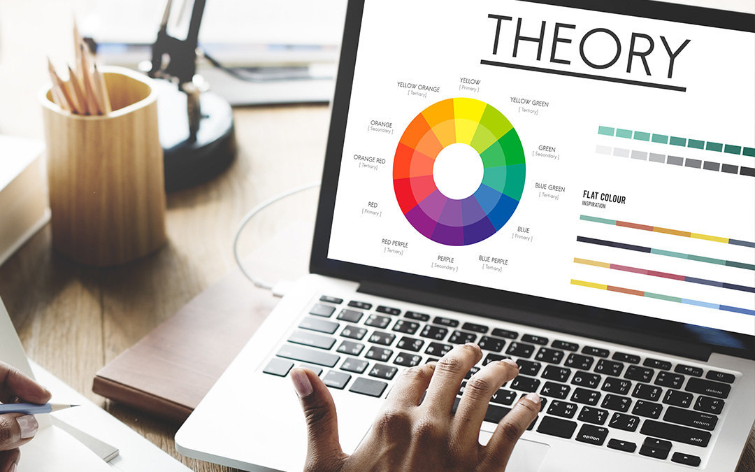
- Primary Colors: The three primary colors are red, blue, and yellow. They do not require the mixture of other colors, and are the keystone colors from which all other colors are created.
- Secondary Colors: The secondary colors are each a mixture of two primary colors.
- Yellow + blue = green
- Yellow + red = orange
- Blue + red = violet
- Tertiary Colors: The tertiary colors are each a mixture of one primary color and one secondary color. These colors are next to each other on the color wheel. Tertiary colors are named for the two colors that comprise them, so blue + violet = blue violet. (That’s the proper name anyway, You may see more interesting names used in marketing, like indigo, teal, etc. Remember burnt sienna from the crayon box?)
Hues, Tints, Tones & Shades
But what if we want to spice things up a bit? Sometimes in design we need to soften, darken or otherwise moderate a color. We can do this by mixing the original “pure” color with white, gray or black to produce tints, tones and shades. The end result is referred to as the “color value”.
- Hue is the pure (original) color
- Tint is a hue + white
- Tone is a hue + gray
- Shade is a hue + black


